Payment app and brand
clearXchange is an electronic payment network owned by a conglomeration of seven of the largest US banks. This makes them faster and more secure than popular payment apps like Venmo or Square Cash, but they sorely lacked a similar frictionless and delightful mobile experience. They asked us to help reposition and brand their business from the ground up while also creating the central digital product.
The identity—
We initially targeted current payment app users by extolling the speed and simplicity advantages of direct bank transfers. But over the course of the project, we shifted instead to the untapped market of 95% of Americans who had never paid anyone with their phone. So the brand needed to feel trustworthy and effortless while remaining unique.
Hundreds of potential names like Buckit, Scratch or Tally were ruled out through painstaking legal review, leading to the final name of Zelle. It works as a verb and isn't limited by the connotations that a dictionary word might have.
With a name and a brief, we began creating scores of rough visual concepts.
We created many concepts that spoke to trust, ease and connection. But with a new product, a mark that communicates the value so unambiguously was impossible to pass up. We wanted to avoid the crowded branding spaces of blue (traditional finance) and green (fintechs). A purplish indigo still felt trustworthy, but more unique and carried connotations of wealth dating back to royalty.
The product—
The core functionality is relatively straightforward and there are prior examples to improve upon, so we worked to also make the experience as branded as possible. The main challenge was explaining to users why a small minority of payments won't go through because of complex business rules. That and the myriad exceptions and rare use cases.
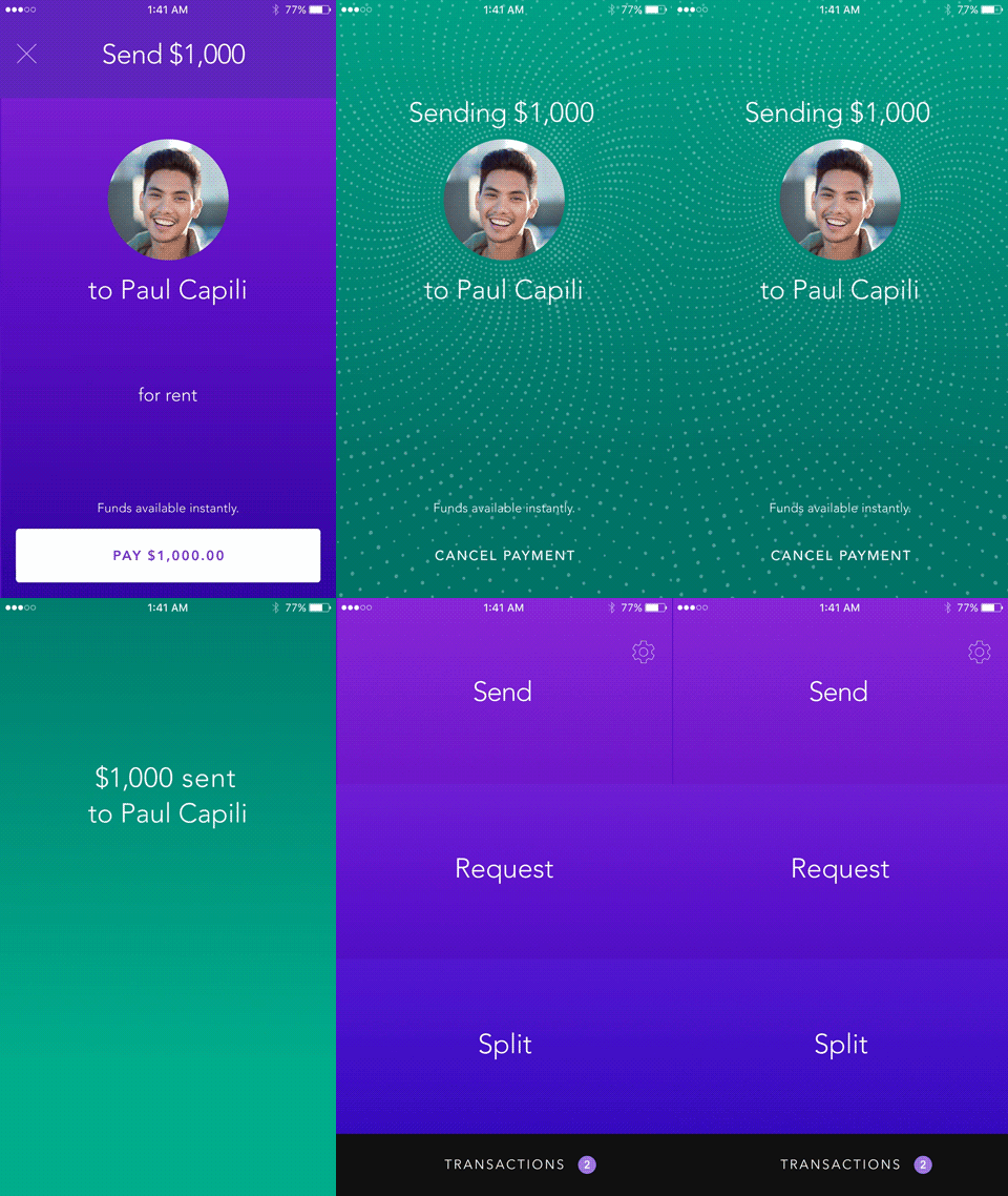
The minimal landing screen is a nice frequent reminder of the simplicity of the product's value proposition. In addition to the standard contacts search, the app will surface contacts you've recently paid. It will also detect other nearby Zelle users via Bluetooth, even if they aren't in your contacts, useful for making one-time payments like in a retail store.
Venmo and Square Cash will let users split a bill in a crippled fashion. We improved on this by both doing the math for you and letting you tweak the individual amounts, nice for everyone with hard-drinking friends. We approached app notifications and the activity history with a card-based system.
Success screen
Because Zelle works on the banks' network, transfers are nearly instantaneous. However, testing showed that if the confirmation came too quickly, it created doubt as to whether it had actually gone through. It was also a good moment for an animation that visually referenced the movement of data as well as traditional cash.
Iconography
As part of our product process, I also created an icon direction that could feel a bit more branded than the prevailing trends while remaining very clear in function.
UI Kit
I collected all the UI elements, colors and type styles we had used, letting us iron out inconsistencies and refine our UX and visual systems. It was also a great resource for developers.
The co-branded product—
Our client is owned by a conglomeration of seven of America's largest banks who have, of course, already invested heavily in their own digital products. However, they quickly saw the superiority of the experience we created and the obvious question was how it could be integrated into their existing apps. Color was our quickest rebranding tool and we did some studies, like this one for Bank of America, to show how effective it could be. With more time, typography would have been the obvious next step.
zellepay.com—
I also led a separate team through the conceptual design phase of the dot com experience. After introducing the product's basic facts, we once again focused on the 95% of Americans who were skeptics. Quant research showed that many of these people are aware payment apps exist, but they don't see how they would make their own lives easier.
Therefore we showed a few common life scenarios where Zelle could really solve a problem. The visual concept was to tie a lifestyle photo to a product screen with animation, a somewhat literal way of showing how the product fits in your life. These were followed by more detailed info on features and security.
Design Team: Dan Schwer, Jen Tank, Jennie Perri, Joan Winter, Katie Magee


